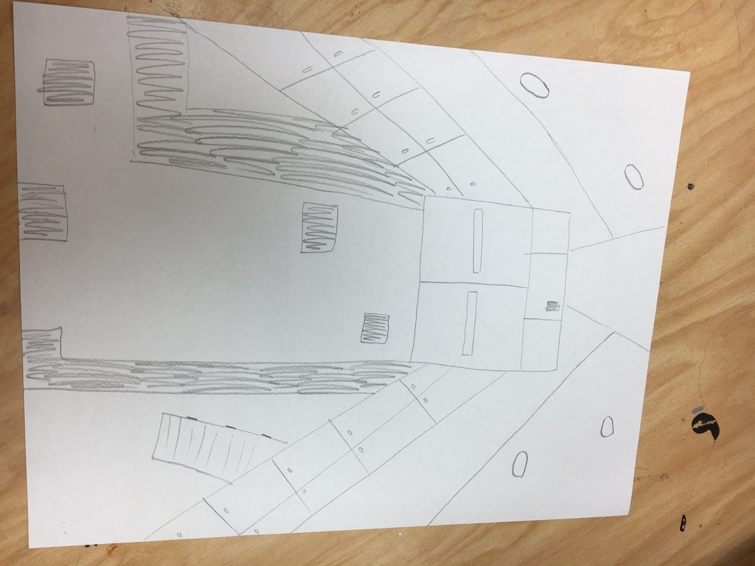
  1. I used first perspective.
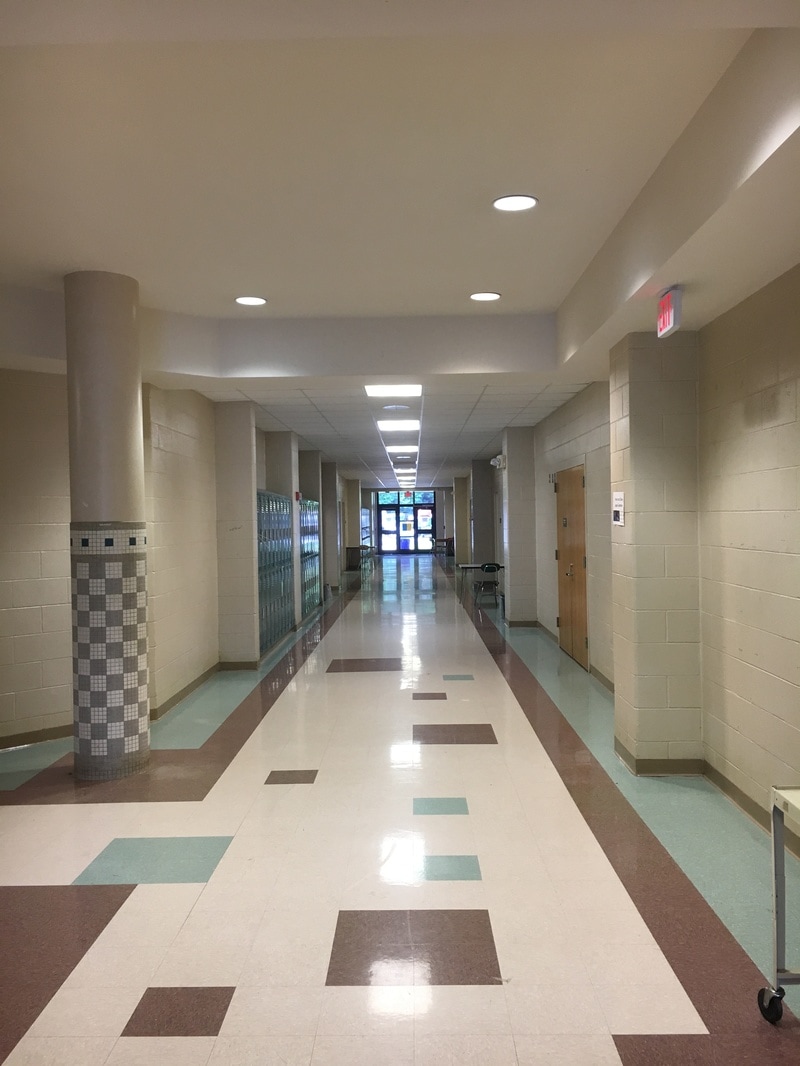
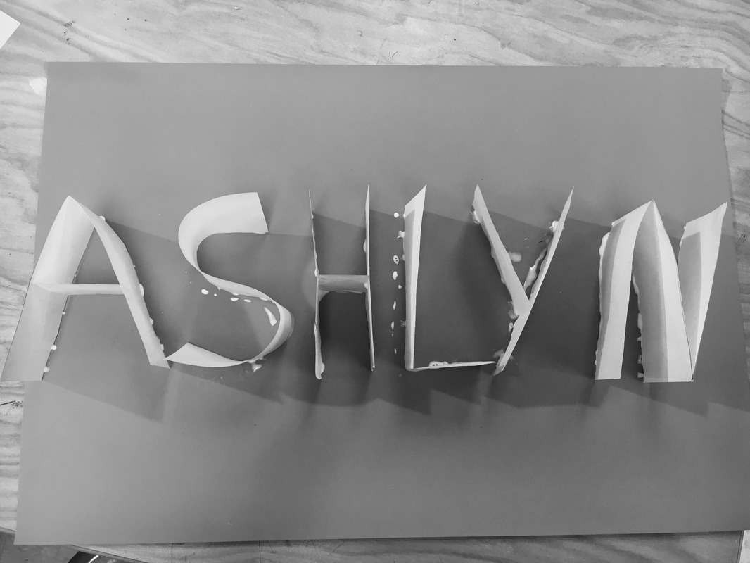
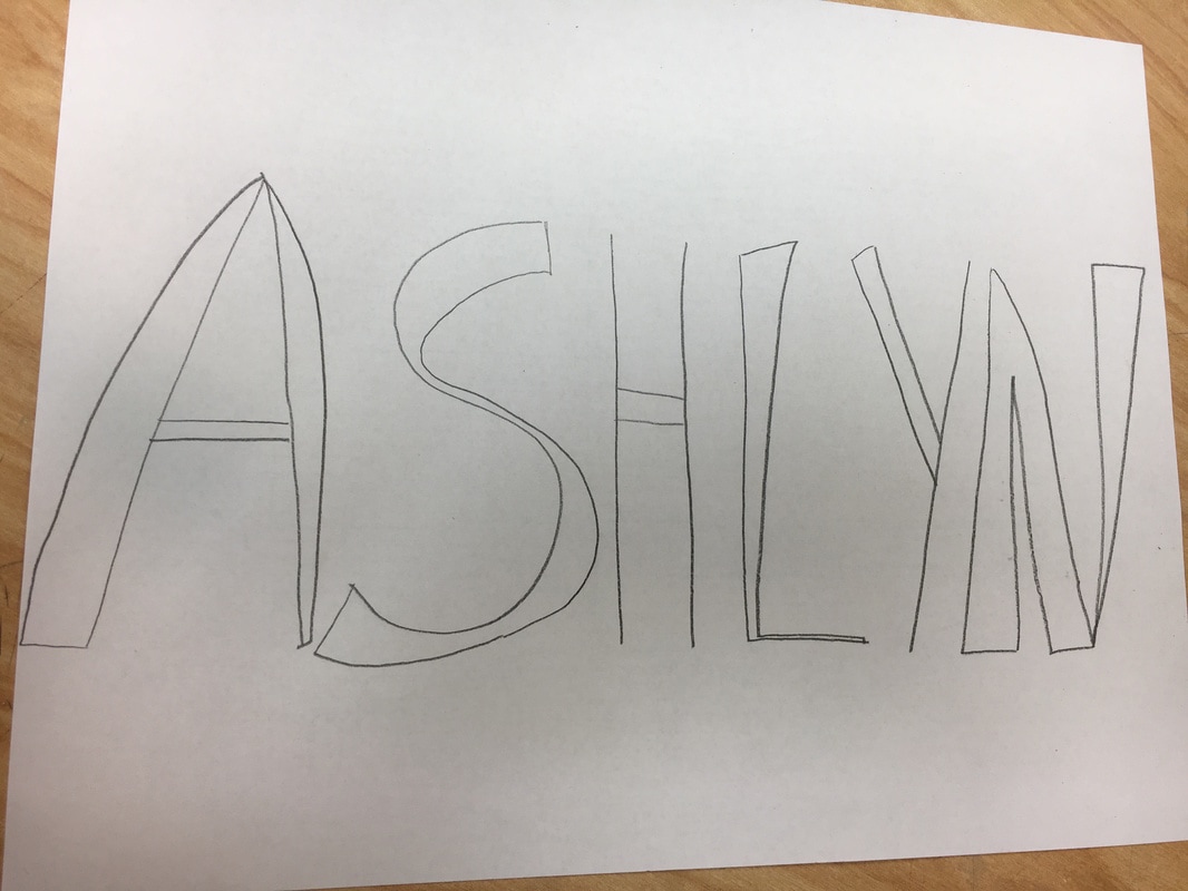
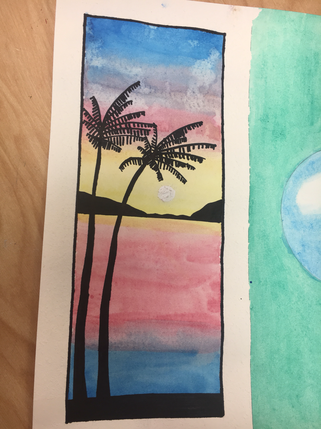
2. I used pencil and paper as my medium. 3. I took the photo in the hallway leading to the art classroom. The hallway gives it a nice perspective. 4. I am very bad at drawing from a picture so this was very hard for me. 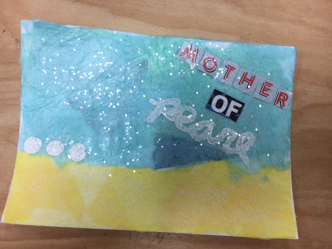 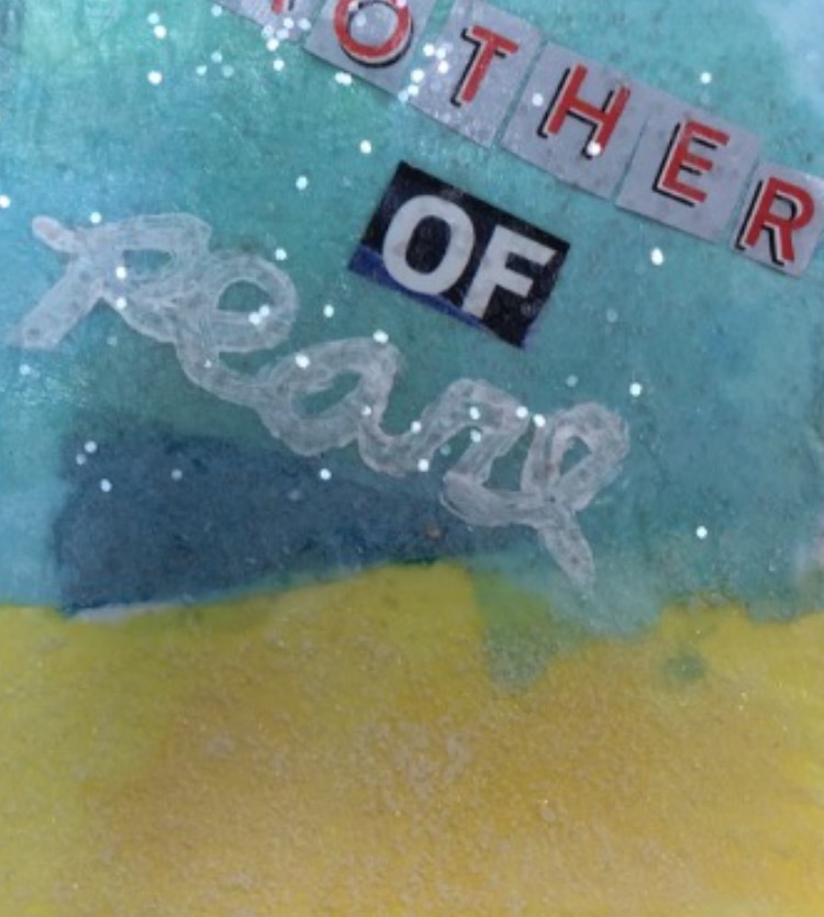 1. I used 6 different mediums/techniques. I used a paper collage as the base. Then I used magazine cut outs to form the words "mother of." Then I used salt to make the bottom portion of the postcard look and feel like sand. Then I used white acrylic paint to paint the pearls and write the word "pearl" on the card. Then I used watercolor and saran wrap to give the "water" portion of the card a more realistic look. Finally, I applied translucent glitter to the whole postcard as finishing touch.
2. My words were "mother" and "ocean" so I combined them by doing a play on words "mother of pearl" with an ocean background. 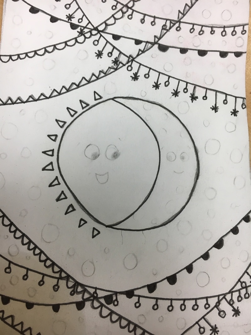 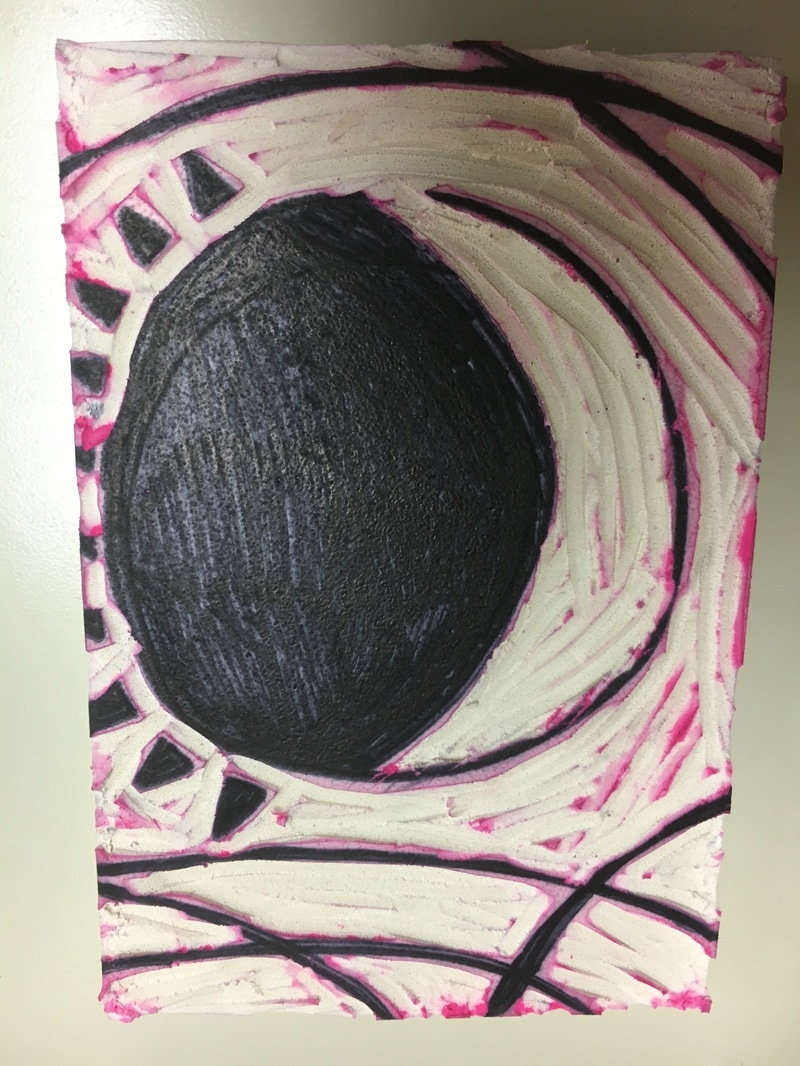 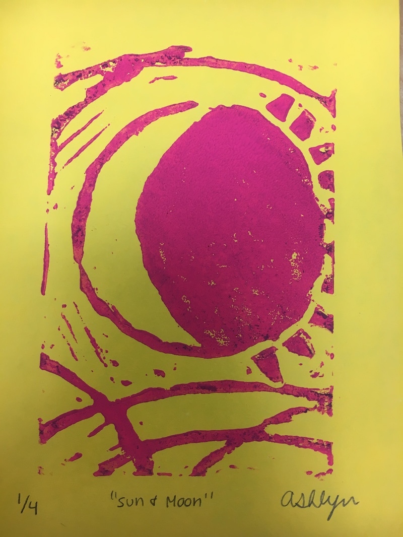 1. My piece includes long lines that run along the top and bottom of the print. This demonstrates the use of "line."
2. If I were to do it again I would have made my sketch a lot less complicated. I didn't realize how difficult it is to use the linocut tools without hurting yourself. I also would have liked to practice linocut tools techniques before using them on my sketch. I made a lot of mistakes that could have been prevented if I had prior experience. 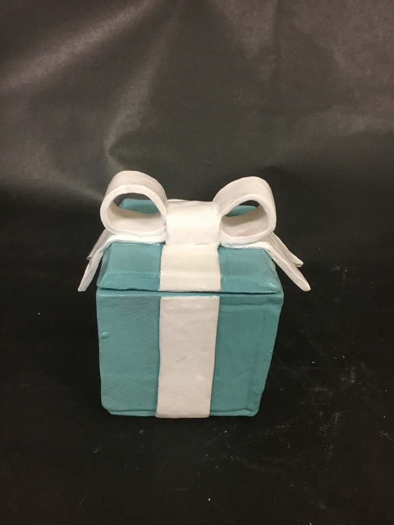 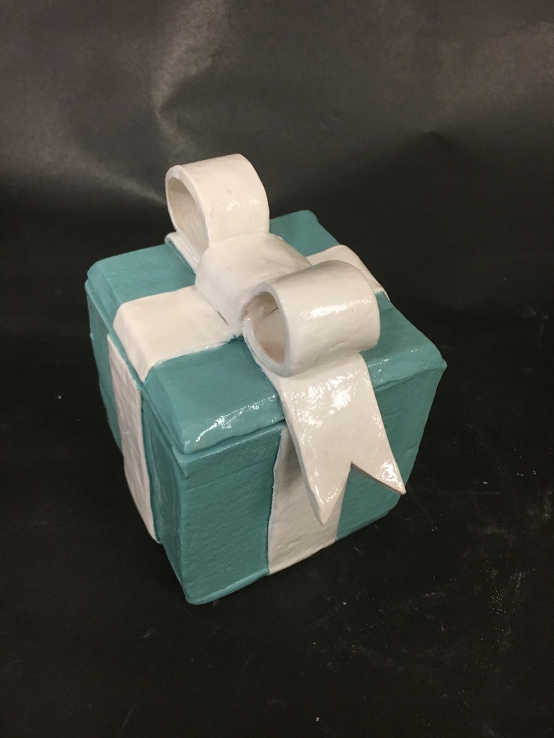 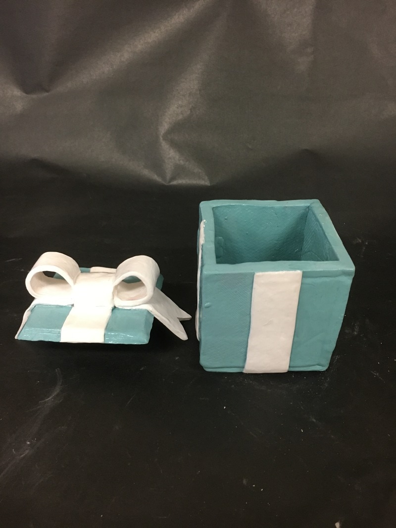 1. I decided to paint my box with acrylic paint in the colors Tiffany blue and white. After I finished with the color I added a clear glaze on top to give the box some shine.
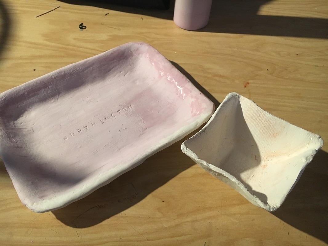
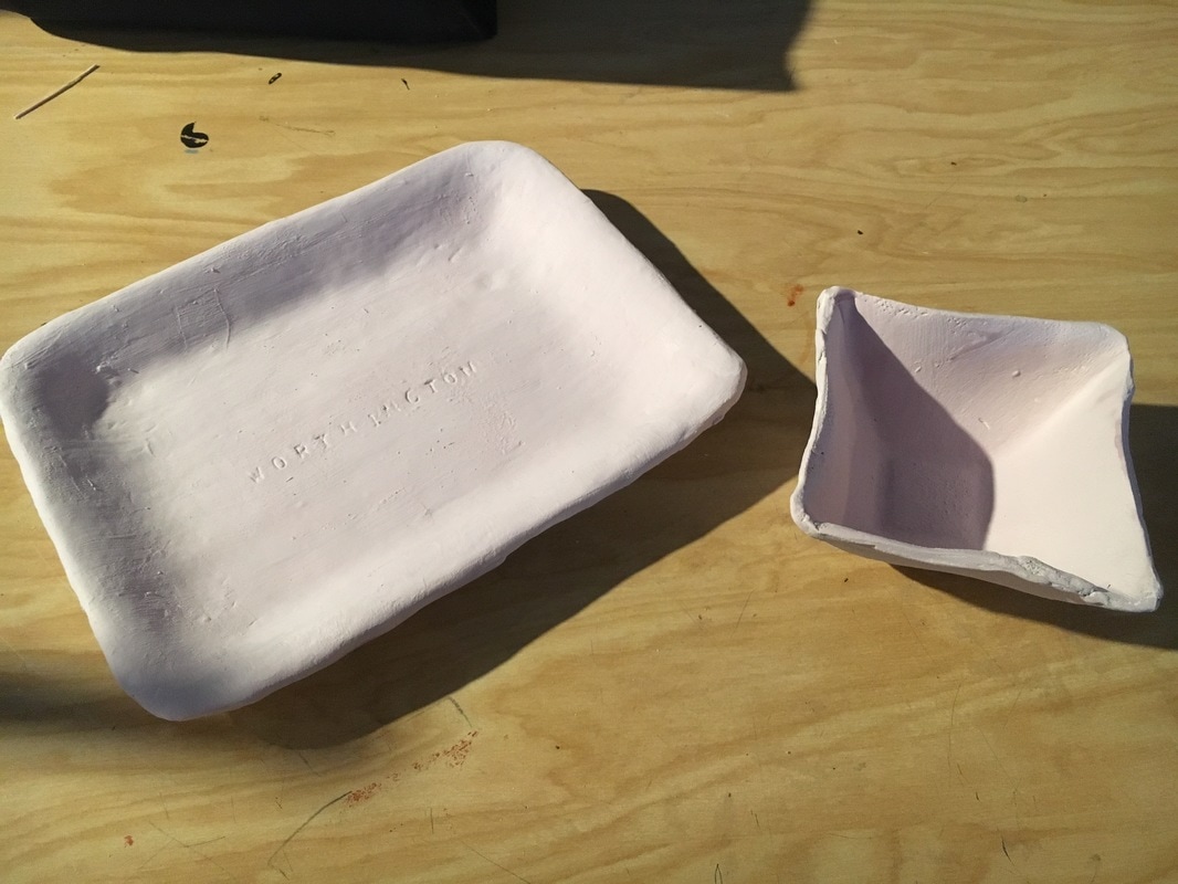
2. The finished piece turned out exactly how I planned it to be. I wanted clean, sharp lines and smooth edges. That was successful. 3. If I was to do a clay box again I would have worked harder on making the slabs perfectly smooth. My piece still had some cracks and bumps in it and I would want to not have that. 1. My box is inspired by the little Tiffany boxes that Tiffany & Co. jewelry come in. I plan to add a bow to the top as a lid for the box. I am also going to be painting it with the iconic Tiffany blue color for the box part, and white for the "ribbon" part. I want my clay box to distinctly resemble a Tiffany box. 2. My biggest struggle was trying to get the clay to not break when trying to form the pieces of the bow. Trying to make the clay flow like ribbon was very difficult. 3. So far I have found that I am very good at making the box part symmetrical. I was easily able to create a box that was even on all sides. 4. I used 6 slabs of clay to create the sides, top, and bottom of the box. Before attaching the pieces to one another, I would scratch and slip the pieces and also add water to make sure that they stayed together. After I was done creating the box and the lid, my sculpture was considered greenware until it was fired in the kiln. 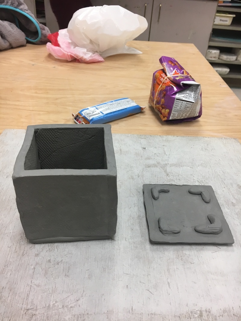 colored pencil sphere Oil pastel sphere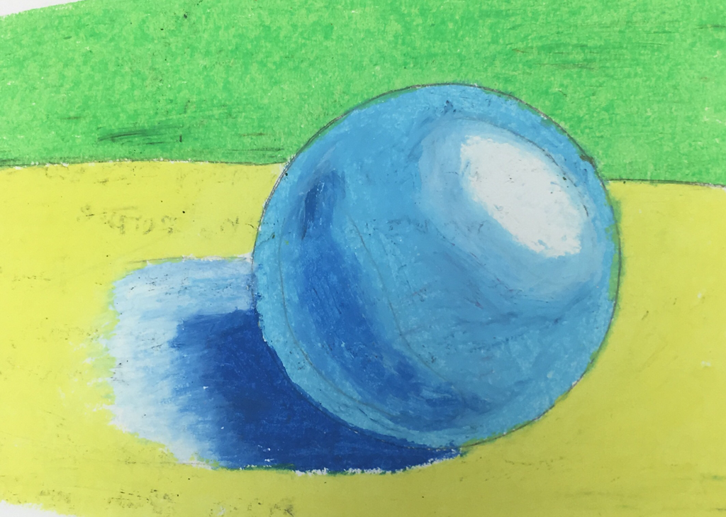 Chalk pastel sphere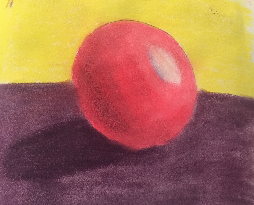 pen sphere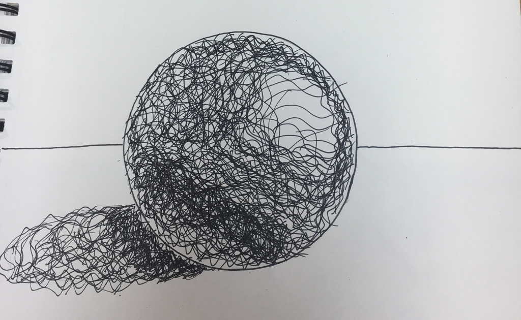 charcoal sphere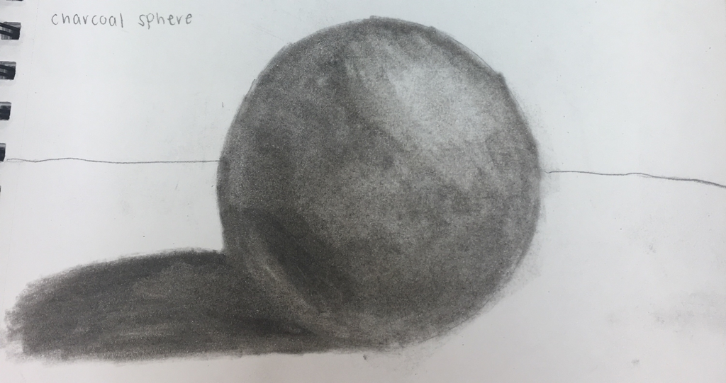 cut paper sphere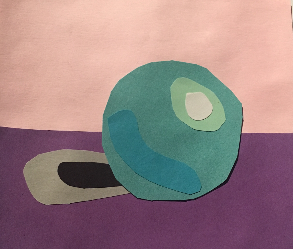 pencil sphere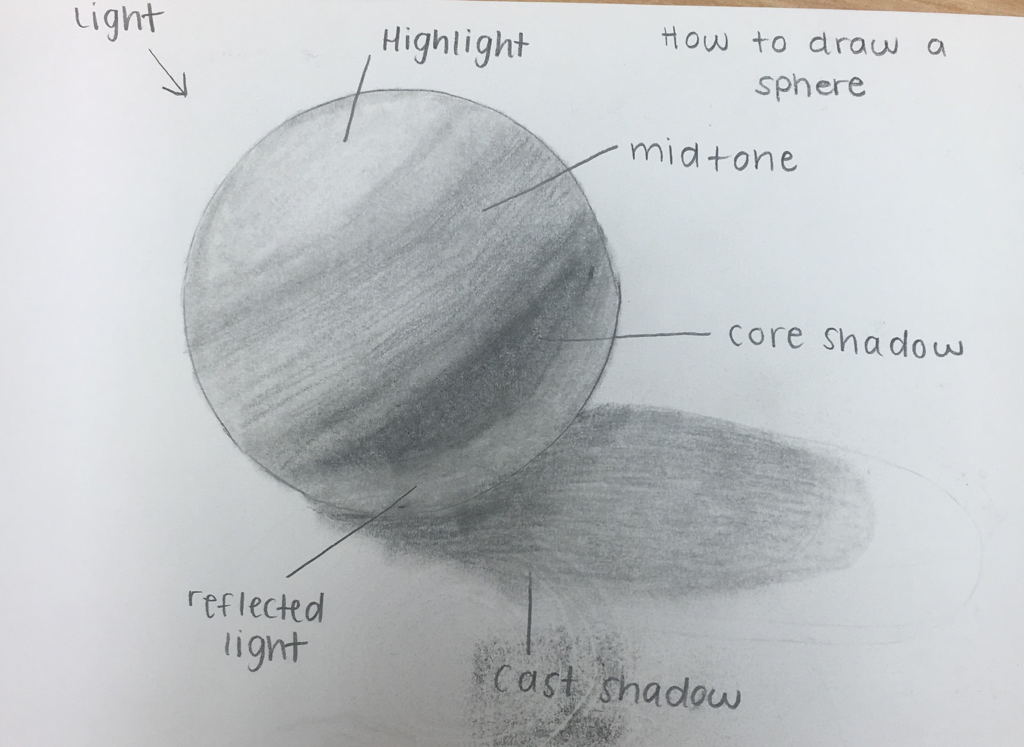 acrylic sphere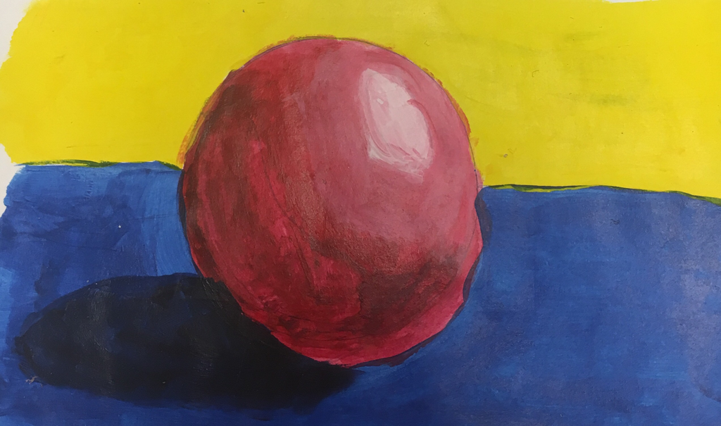 watercolor sphere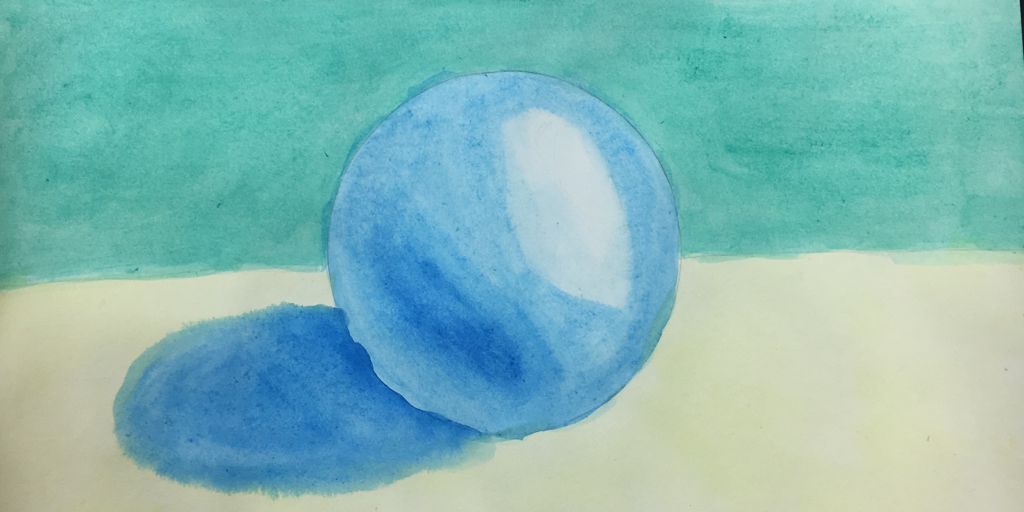 Favorite Medium
Least Favorite Medium
|
AuthorAshlyn Worthington Archives |
 RSS Feed
